Fitness Programs
The fitness programs at Gymondo are the main component of the app that keeps users active. New programs are added regularly, with most releases and overall content launched from November to February.
Programs were split into influencer and evergreen categories. Influencer releases were prioritised due to the influencer’s reach and relevancy, while evergreen content was typically released in slower months to diversify the program pool.
Fit im Freien was an evergreen summer release, but what made it special was the concept. Beyond being a standalone program, it created summer-long content through three days of coordinated photo and product shoots.
The complete summer concept, developed by Gymondo’s marketing division, pre-planned every detail of the shoots — from backgrounds and angles to clothing, equipment, and models. Only the location and photographer were pre-determined.
Promotional material from Fit im Freien was distributed across the app, desktop client, CRM, Meta, and Google Ads. The concept lasted until fall 2024 and generated positive momentum during an otherwise slow season.

Email Marketing
CRM, the email marketing division at Gymondo, focused on three key areas: acquisition, retention, and engagement. With acquisition, offers about the Gymondo app and other discounts, like fitness shop vouchers, were sent via email to subscribers. Retention focused on keeping the subscribers through product offers, new recipes, and the use of automated emails that recap users’ weekly status with the app. With engagement, the focus was on building the Gymondo fitness community through communication about new program releases, upcoming events, competitions, and news.
The following examples show the three focus areas of CRM and how the visual communication was created to facilitate acquisition, retention, and engagement.
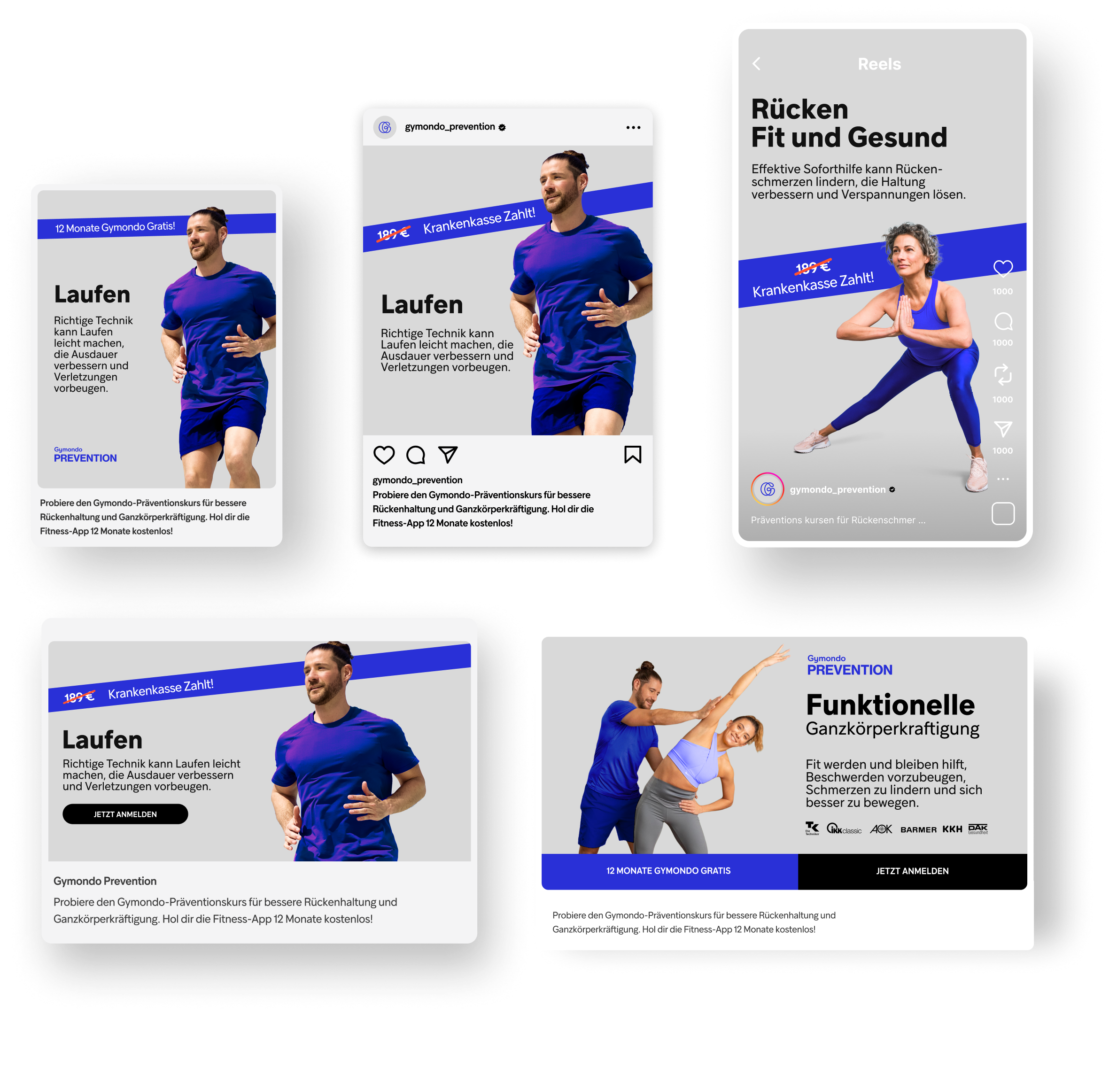
Reimagining Gymondo Prevention
Gymondo Prevention is a sub-brand within Gymondo that focuses on preventative exercises. The program is accessible through health insurance providers like Techniker Krankenkasse or by subscription. As of 2025, the platform hosts three focused programs each focusing on their respective category: Rücken Fit und Gesund (healthy back), Funktionelle Ganzkörperkraftigung (full body strengthening) and Laufen leicht gemacht (running made easy).The revamp of Gymondo Prevention prioritised the updating the desktop and mobile portals which subscribers would access the platform.
The new and improved visuals were meant to reduce visual clutter by using more concise colour profile, imagery as well as introduction of white space as a calming element for better information absorption.
Concept
Instead of completely discarding the previous UX hierarchy, the old one was used as a the basis. Some sections were re-arranged for more logical and user friendly information flow. One new feature was also introduced, that was not part of the original Gymondo Prevention app, which was the program carousel after the header image.
A significant focus of the revamp was also typography and text based content. The original version of Gymondo Prevention felt cluttered with five different font sizes and font weights. This concept meant to bring down the clutter and make the font styles more frugal in an attempt to make the information that was provided better to absorb.
On top of the information hierarchy and typography, a great deal of focus went into the colour scheme. In the original design, the colours were following a loose guidelines, but was not enforced in any manner, sort of feeling based system that relied on previous work on the platform. The proposed concept however, focused heavily on blue tones. Why blue? Because it is the safest choice when you think about the popularity of a colour within a broad range of people. To bring the blues to the 21st century, we introduced a more brighter hue of blue, on the crisp, which work well on digital devices due to screens being able to show certain colours more vividly. The selected blue also works well as a highlight colour, which practically meant, we didn’t need to expand the colours scheme.


Performance Marketing Samples
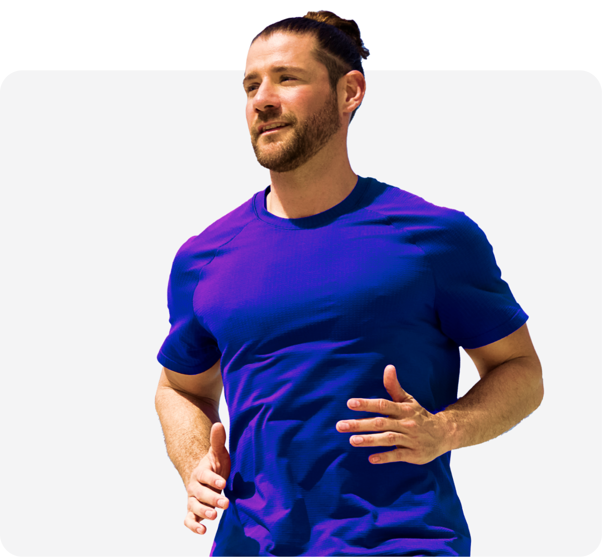
Example work of performance marketing assets for Gymondo Prevention. The ads were designed to be minimal and informative. An ad campaign could have multiple elements on top of the usual trio of text, image and a cta. These other elements were in most cases logos from other partners, as well as a highlight such as a limited time offer or customer benefit.
The structure of the ads were intended to feature the models as the key focal point of the ads, since we deemed that the presence would do three things to the viewer: direct, fill and sympathise. The rest of the elements, such as logos, headlines and body copy, would follow a rigid but simple layout structure, so that all of the elements could be positioned harmoniously and with necessary informational hierarchy.